The data does not care about your assumptions
We started this analysis expecting to confirm what most attribution guides tell you: peak engagement on weekdays, desktop for B2B, mobile for consumer, email drives the most intentional clicks. Some of that held. Most of it didn’t.
Over eight months, we processed just over ten million clicks across campaigns from a range of industries — SaaS tools, e-commerce, creator newsletters, and a handful of event promotions. The UTM data was clean enough to work with. What we found was worth writing down.
Mobile is not a consumer-only story
The assumption that B2B audiences click from desktop is stale. Across LinkedIn-sourced traffic in particular, 61% of clicks came from mobile devices. This matters because if your landing page isn’t built for mobile, you’re burning budget on a broken experience — and your UTM data will show a high bounce rate that looks like a campaign problem when it’s actually a conversion problem.
The channels where desktop still dominated: direct email (newsletters opened in a desktop client), paid search, and retargeting ads on YouTube. Everything social skewed heavily mobile.
The Thursday anomaly
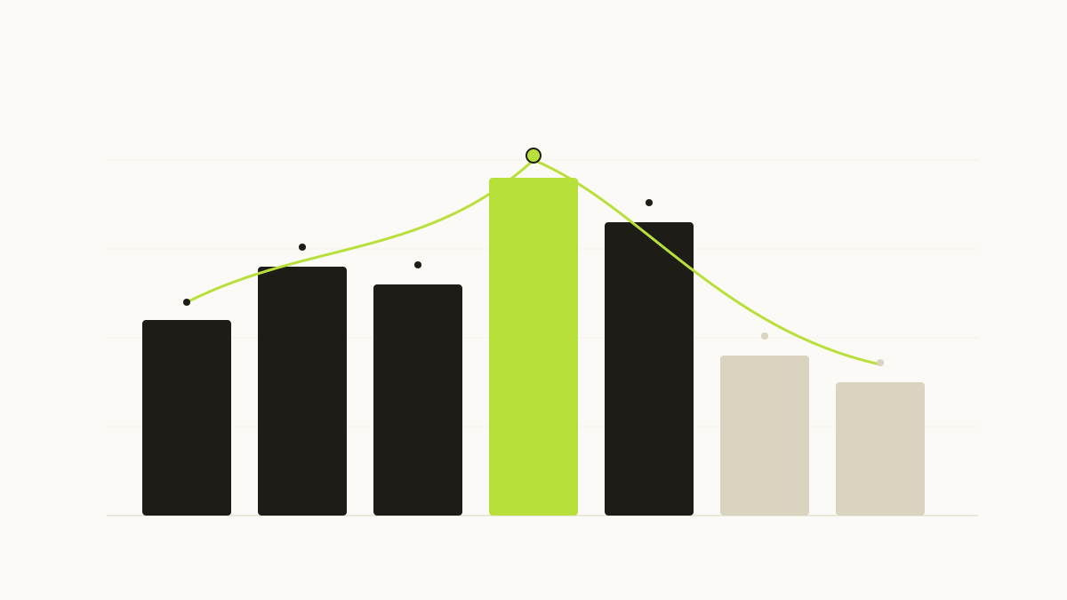
We expected Monday and Tuesday to lead on weekday performance. They don’t. Thursday is consistently the highest-converting day across almost every industry vertical we looked at. Not just the highest click volume — the highest conversion-to-click ratio.
Our best guess: by Thursday, buying decisions that started on Monday have matured. People have had time to loop in a colleague, revisit the problem, and are now ready to act. This is a small thing, but if you’re scheduling email sends or social posts, shifting even one campaign from Tuesday to Thursday is worth testing.
UTC offsets lie about your real audience
One of the more tedious discoveries: many tools report click times in UTC, which makes geographic patterns invisible unless you convert manually. When we normalized timestamps to local time zones, we found that what looks like a dead period at 2 AM UTC is actually peak hours in Southeast Asia — a region several campaigns were inadvertently reaching.
If your attribution platform doesn’t surface local-time breakdowns, you’re reading noise as signal.
Dark traffic is larger than you think
Roughly 18% of clicks in our dataset arrived with no UTM data at all, despite the source links being fully tagged. This wasn’t a tagging failure — the links were confirmed correct. It’s a combination of things: link preview crawlers that inflate counts, messaging apps that strip query parameters, and native iOS/Android share sheets that don’t pass referrer data.
The practical implication: if you’re comparing two campaigns and one runs primarily through SMS or iMessage while the other runs through email, the SMS campaign will look underperforming in any UTM-based report. It isn’t. It’s just invisible.
What this changes about how we tag
A few adjustments we made after this analysis:
- Added a
utm_contentvariant specifically for mobile vs. desktop ad placements, so creative performance doesn’t get averaged across device types. - Stopped using
utm_termas a catch-all field and reserved it strictly for paid keyword data. Everything else went intoutm_content. - Built a weekly check for clicks missing UTM parameters against expected source volumes — a delta of more than 15% in either direction flags for review.
The click data is always trying to tell you something. The challenge is building the tagging discipline and tooling to hear it.